work / bookshop
Bookshop.org
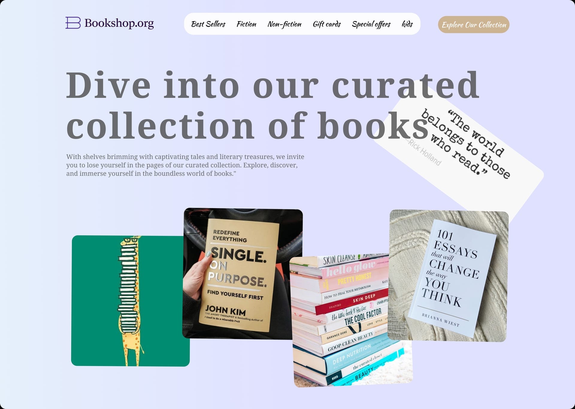
A Bookshop.org landing — Dive into our curated collection, a Rick Holland quote card, and a four-up of covers and illustration.
- Role
- Web designer / UI
- Type
- Web · Startup pages
- Year
- 2025
Challenge
A bookstore homepage is usually a catalog. Bookshop.org needed to feel curated on first sight — a place you would wander, not a grid you would filter.
Approach
The serif line does the invitation: Dive into our curated collection of books. A tilted white card holds Rick Holland — The world belongs to those who read. Four tiles underneath do the merchandising: illustration, a hand holding John Kim, a wellness stack, Brianna Wiest on knit.
Design
Lavender canvas, dark type, a pill nav, a tan Explore Our Collection. Corners stay round. The quote is allowed to sit off-axis so the page feels handled, not templated.
Execution
Nav is Best Sellers, Fiction, Non-fiction, Gift cards, Special offers, kids. Body copy stays in the register of shelves and treasures. The four stills carry the shop without a product grid.
Retail web for books is editorial work. If the first screen does not feel like a table of books you would pick up, the collection never starts.