work / savannah-pay
Savannah Pay
Product and UX/UI for Savannah Pay — a pan-African payments app, from peach onboarding (welcome, discover, insights, security) through cards, home and analytics.
- Role
- Product designer
- Type
- Product · UX/UI
- Year
- Ongoing
Challenge
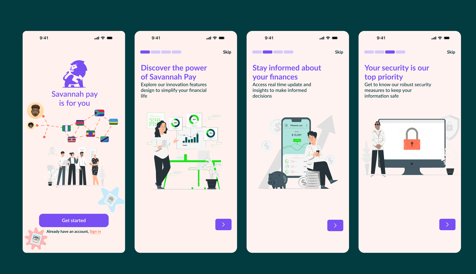
A payments product for the continent cannot feel generic. Savannah Pay had to introduce itself in four screens — welcome, discover, insights, security — and still hold a real Kenyan money loop: banks, cards, KES, M-Pesa.
Approach
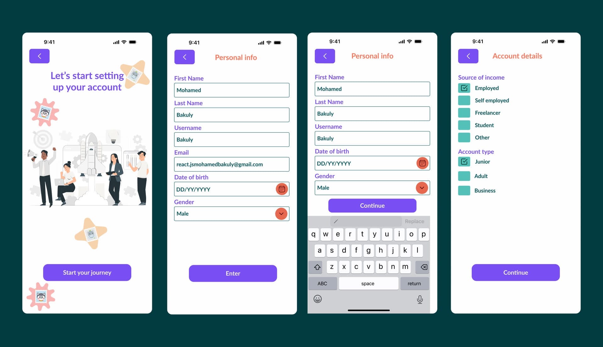
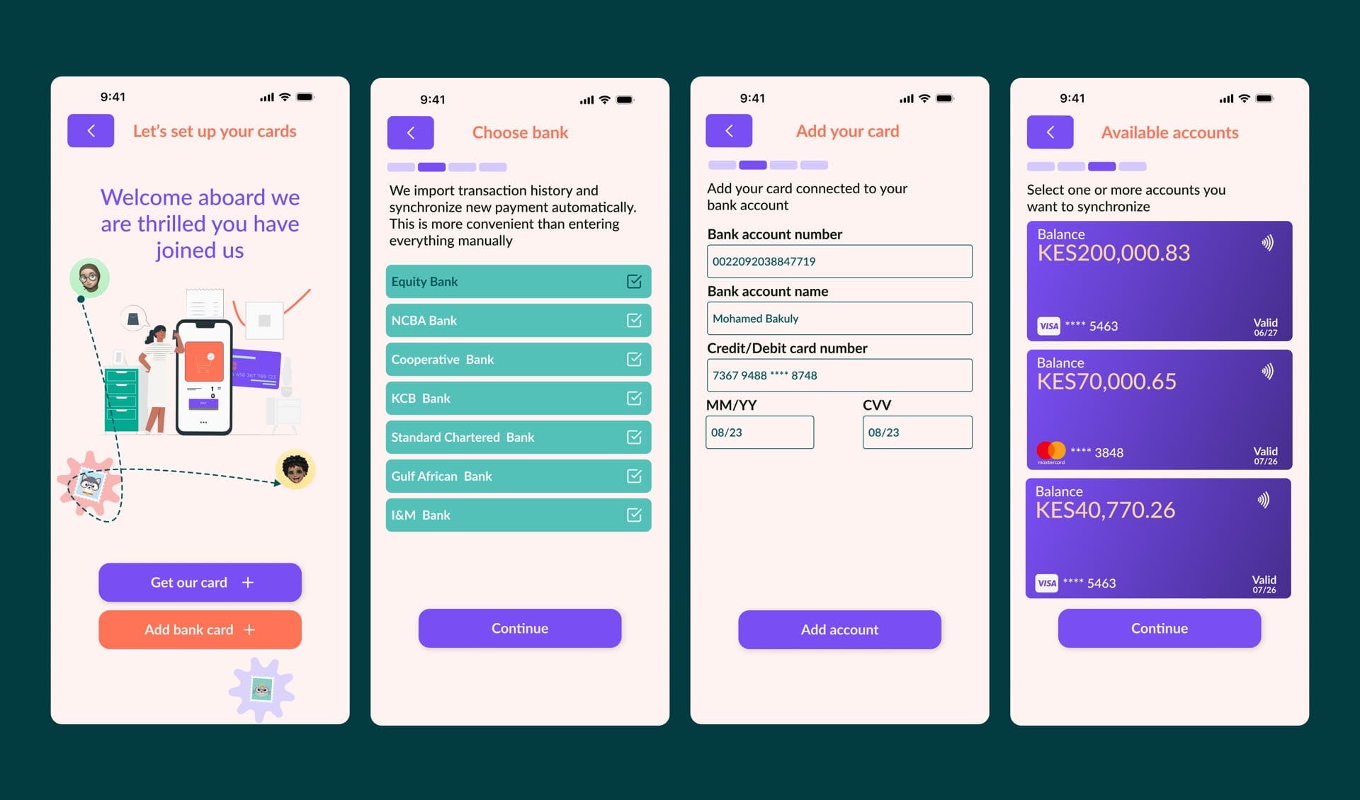
The work starts on peach. Welcome: lion logo, “Savannah pay is for you,” African flags, Get started. Then discover the product, stay informed at $15,597, and a padlock for security. After that, personal info, account type, cards, home.
Design
Peach/pink canvas, purple headings and CTAs, green illustration accents. The lion mark sits on welcome. Skip and a four-segment bar carry discover, insights and security. Status is colour with a job: purple to continue, green for selected banks and success.
Execution
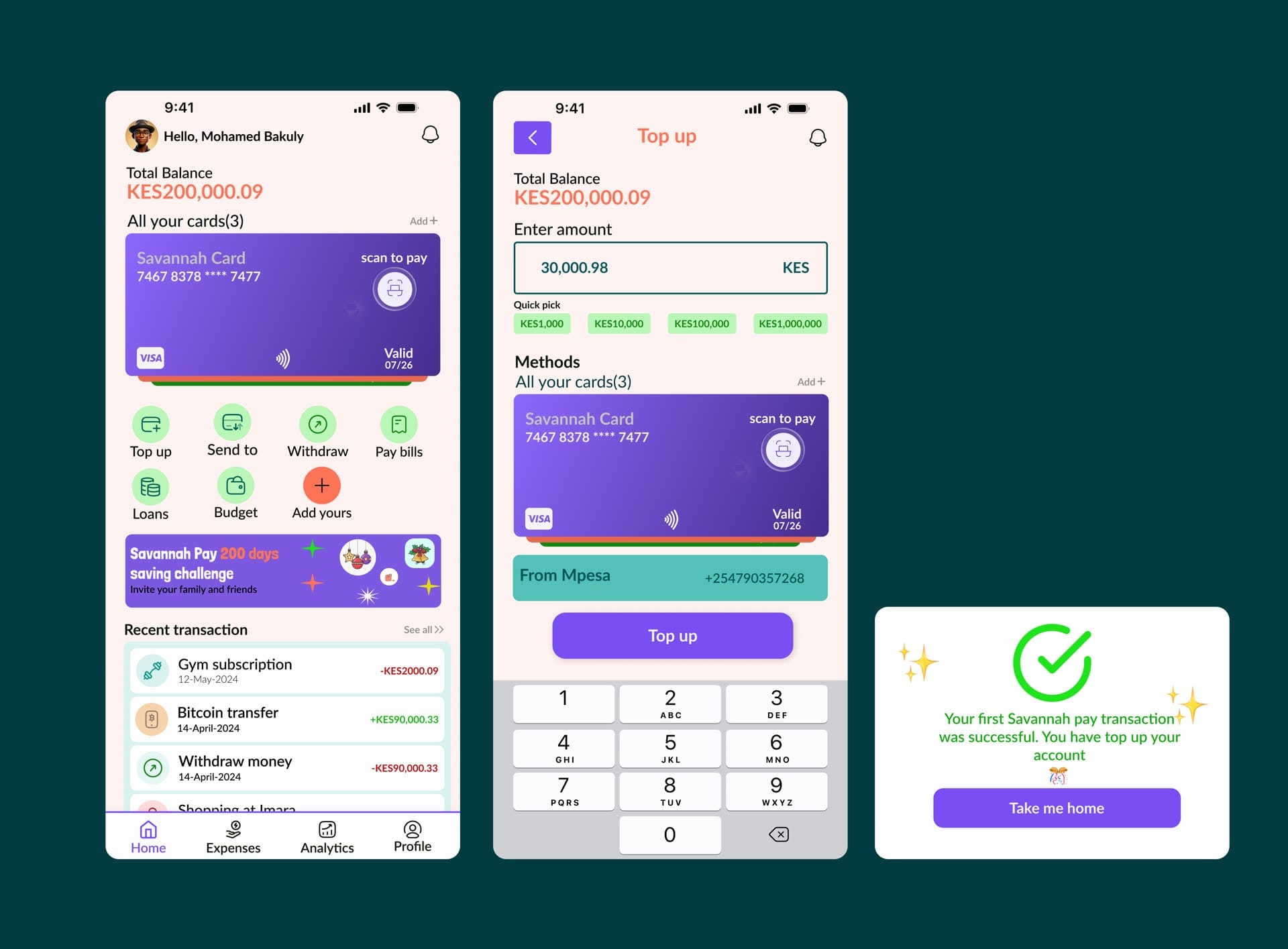
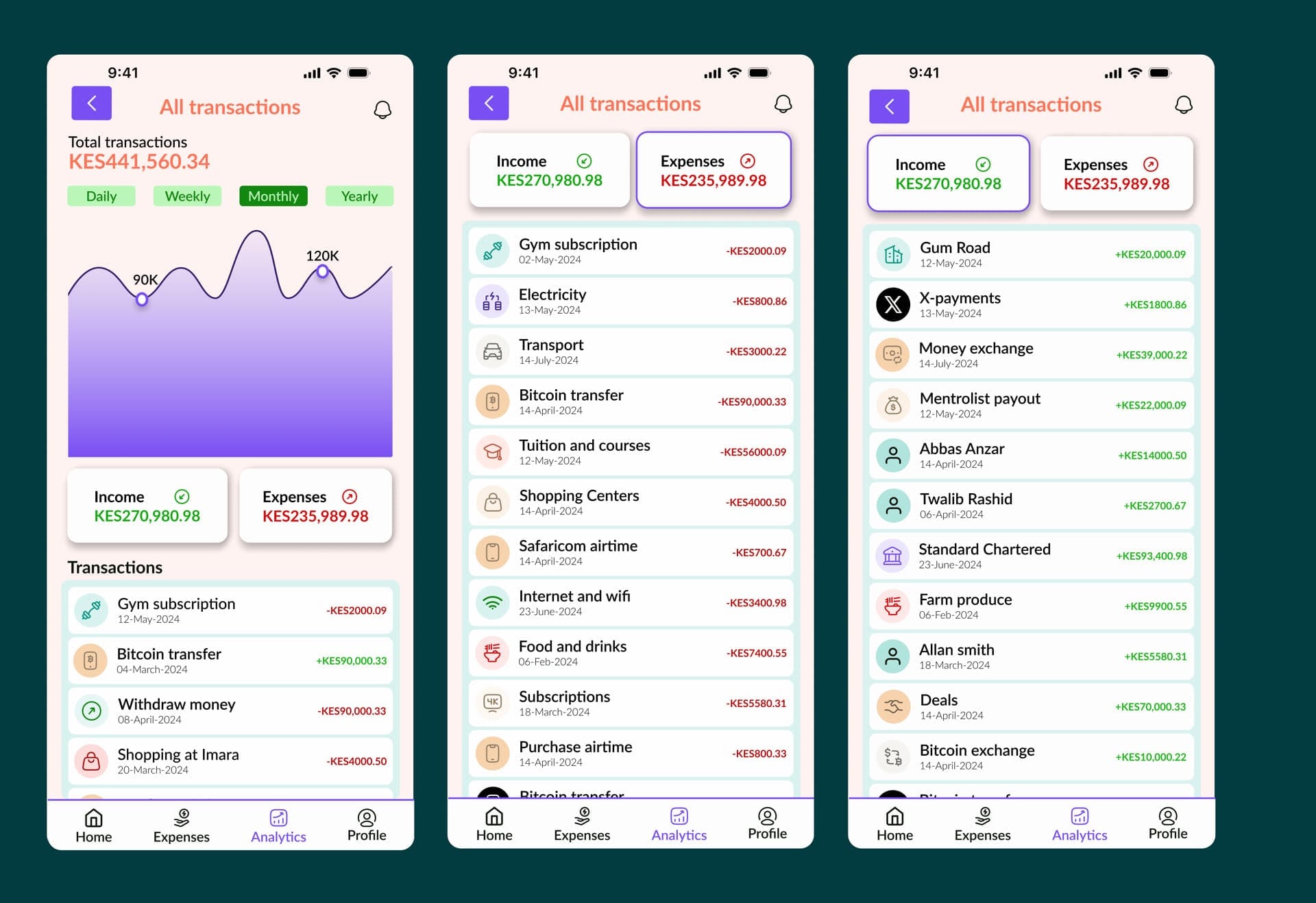
Screens cover the real surfaces: Get started and Sign in; personal info and Junior/Adult/Business; Equity, NCBA, KCB and Gulf African Bank; Hello, Mohamed Bakuly on home with KES 200,000.09; top up 30,000.98 from M-Pesa; monthly analytics at KES 441,560.34.
Frames
In financial interfaces, trust is a design outcome. Clarity is the feature.